CC2 - Week 10 - Interface Design
Got Wood? The following zip file contains the main patch "MaxWeek10" and the associated Cubase file "CubasWk10". Remember to set the inputs and outputs on the patch so it is where you intend the signal to go/come from. All the graphics were made on Adobe Photoshop CS2, using a couple of background images I downloaded, namely a wood one and a strange golden pellet one. After struggling for ages with 'coll', I decided to just use the 'seq' MIDI recorder, and I am very glad I did due to the ease of use. Some of the buttons etc. may not line up properly on some computers- they have been set to look correct on the Macs in the Audio Lab.
When switching on the Probability Note Generator, there is a small animation akin to an old analog display booting up. I did this by fading the colour of the multislider from black to yellow, and sending a bpatcher with the note names in it some staggered offset data, stored in a coll. You may also notice that the multislider itself looks different- there are underscores covering the sliders in such a way that it seems to have blocks instead of sliders. There is indepth descriptions of the Envelope Randomiser inside the patch "bkp.Slidermania". The Note Generators are in the patch "bkp.ProbAndRand".
To access the rest of the patch, unlock the window and click on the message "window title, window exec".
~Patch File 1.4MB~
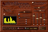
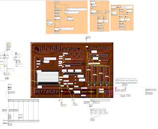
Main GUI Unlocked
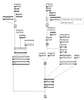
Random Generator Control Centre
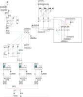
Melodic Generator
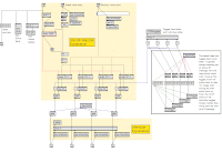 Smooth Random and After Sliders
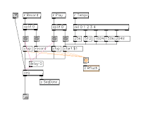
Recorder
6 comments:
Although you probably spent way too much time on this (to the detriment of other Uni work), you obviously have a knack for graphic design - the interface work is awesome. Well done.
Well if I'm going to fail Theory, History and Music Ed I may as well go out with a bang. Every time I use Photoshop I begin to think I have exhausted its potential, then something else comes along- in this case Layer Blending. I can't wait until I can afford a legal version, I'm sure it would make its use all the more rewarding. Cheers for the comment, I'll check out everyone else's patches when I've prepared my Perspectives talk.
Ur patch is frickin amazing! Looks like an app off the shelf.
Well done!
Cheers! It's funny how much your profile pic is the Mac equivalent of mine. The only difference is mine has a 90% market share - BURN!
What a fantastic GUI. Your patch design looks clean and logical too. Great work.
ahhh it's overated...
1.5 stars
haha jokes, awesome work dude. AWESOME!
Post a Comment